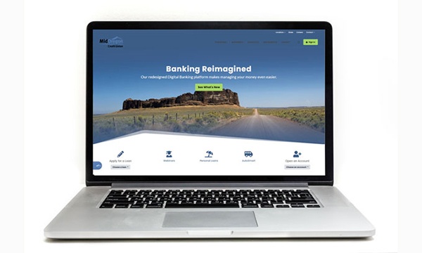
Refreshed site with new features
Our updated Mid Oregon website has a new look! The new design is easier to use on all your devices. Whether you’re using a smartphone, tablet, or desktop computer, you’ll have faster loading, great-looking graphics and easier to find features.
Access your account from any page
We’ve updated our Account Login button so it’s now available from anywhere on the site—no matter where you go, just click the green “Login” button on any page to go straight to your account. No more scrolling, no more having to go back to the home page to log in.
Accessibility tools customized for every user
We know that all users are different. For members who have physical or visual limitations that make some websites difficult to use, we’ve introduced our ADA widget. Just click the ADA button on any page, and choose the settings or options that work best for you. Type size, colors, and settings to work best with adaptive technologies—you’re in control.
Choose with confidence
Looking for a checking account, but don’t know which one is best for you? Our automated Checking Chooser can help you narrow down your choices and find the account that will save you money and make life easier.
Click the “Help Me Choose” button on the home page or our Checking Accounts page. We’ll walk you through an easy series of questions to narrow down the best option. Then, open your account online, or ask someone to contact you by email or phone to help you get started. It’s easy and fun!
We’re excited to show our members the changes on our updated Mid Oregon website (midoregon.com), so please feel free to take a look around and let us know what you think! Send us a message anytime to submit your comments or suggestions for improvements.
